

Most people analytics functions don't fail because the math is wrong. They fail because nobody agreed on what "attrition" means before three different teams calculated it three different ways, and by the time the exec team notices the numbers don't reconcile, trust is gone. In a centralized team you can paper over this with a shared spreadsheet and a Slack channel. In a federated setup — where a regional HRBP owns headcount data, a TA lead owns pipeline, and a comp analyst sits in finance — that same ambiguity turns into quarterly arguments and stalled decisions.
A people analytics operating model is the thing that stops those arguments. Not a dashboard, not a data warehouse. An operating model: who owns which metric, how definitions get standardized, how a number moves from a chart into an actual decision, and how often people meet to act on it. This piece is about how that system holds together when the team is distributed, and where it tends to crack as the org grows.
Why federation breaks analytics differently than centralization
When one team owns everything, inconsistency is a discipline problem. When ownership is federated, inconsistency is structural — it's baked into the reporting lines.
A pattern that shows up again and again: a company grows past a few hundred employees and splits HR by region or function. Each unit inherits its own HRIS quirks, its own local definitions, sometimes its own tooling. EMEA counts a contractor conversion as a "new hire." APAC counts it as an internal move. Neither is wrong locally. But roll them up and the global time-to-fill number is meaningless, because half the "fills" aren't the same event.
The deeper issue is incentive drift. A regional HR lead being measured on time-to-fill has a quiet reason to define "fill" generously. A TA team measured on offer-accept rate has a reason to exclude candidates who ghost before the formal offer. Nobody is lying. Everybody is optimizing their local scoreboard, and the federated structure means no single person sees all the scoreboards at once.
This is why federated analytics needs governance before it needs sophistication. You can have the fanciest predictive model in the world, but if the underlying definitions drift by business unit, you're modeling noise. Most of the useful work here is boring: taxonomy, ownership, cadence. The interesting part is making that boring work survive contact with a distributed org.
The four layers that actually make it work
A functioning operating model has four moving parts that connect to each other. Skip one and the others degrade.
Eliminate HR bottlenecks with smart automation.
Hiryly simplifies your HR operations so you can focus on people, not paperwork.
- Centralized candidate tracking
- Automated onboarding workflows
- Performance & compliance dashboards
No credit card required
-
Metric taxonomy — the shared dictionary. What each metric means, how it's calculated, what's included and excluded, and which unit's data feeds it.
-
Data-owner RACI — who is Responsible for the raw data, who's Accountable for the metric definition, who's Consulted on changes, and who's Informed when it shifts.
-
Dashboard-to-decision mapping — every metric on a dashboard tied to a specific decision it's supposed to influence. Metrics with no decision attached get cut.
-
QA and cadence matrices — lightweight checks that run before numbers go out, plus a calendar that defines who looks at what and when they act on it.
The order matters. Taxonomy without ownership means definitions rot. Ownership without cadence means nobody revisits stale metrics. Dashboards without decision-mapping means you build beautiful reports nobody uses. If you've already read our take on how an HR metrics operating system makes KPIs reliable, think of this as the federated-team version of that idea — same bones, harder coordination problem.
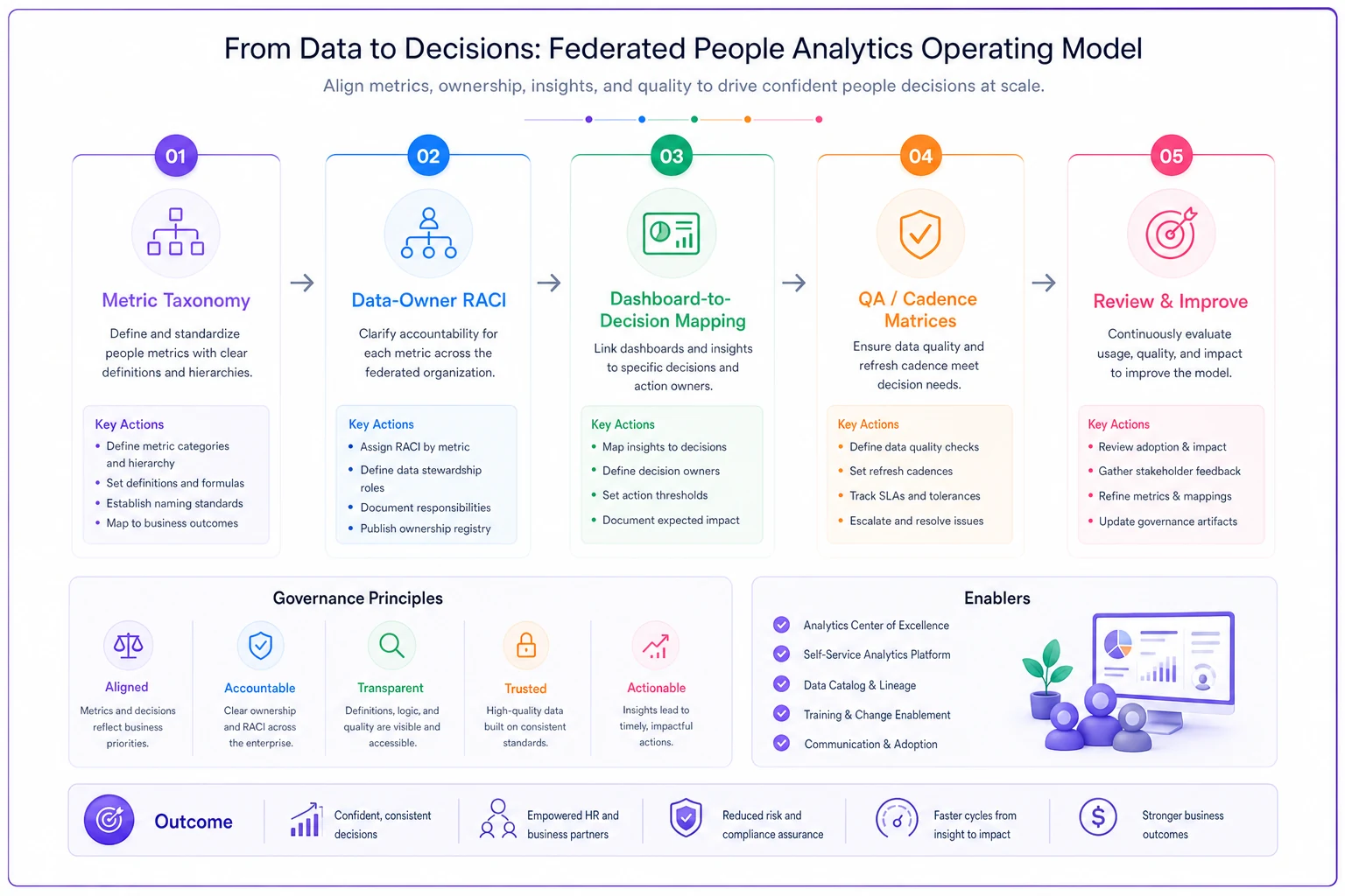
A simple visual of how these four parts connect.
Building a taxonomy that survives multiple owners
The taxonomy is where most teams start, and where most give up, because it feels like bureaucracy. But in a federated model it's the only thing keeping five versions of "engagement" from coexisting.
-
Name — the canonical label, no synonyms allowed
-
Plain-language definition — one sentence a hiring manager could understand
-
Formula — exact numerator and denominator
-
Inclusions/exclusions — the edge cases that cause the most fights (contractors, internal moves, rescinded offers, boomerangs)
-
Source system — which HRIS/ATS field, from which unit
-
Owner — the single person accountable
That inclusions/exclusions field is the one everyone underestimates. In real operations, that's where 80% of the reconciliation pain lives. Two teams can agree on the formula for regrettable attrition and still produce different numbers because one counts a failed relocation as regrettable and the other doesn't.
A pattern worth stealing: version your definitions. When APAC changes how it classifies internal moves, that's a definition change with a date attached — not a silent edit. Anyone comparing this quarter to last quarter needs to know the ruler changed. Teams that skip versioning end up explaining fake trends to executives, which is the fastest way to lose credibility.
Version your definitions and attach dates to changes so comparisons remain valid.
One more thing on scope. Don't try to standardize everything. Standardize the 15–20 metrics that roll up to leadership and cross business units. Let local teams keep their operational metrics local. Forcing a global taxonomy onto every regional workflow metric creates resentment and doesn't buy you anything, because nobody's comparing those across units anyway.
Data-owner RACI: the part everyone gets wrong
Most RACI charts fail because they assign accountability to a team instead of a person, or they conflate "owns the data" with "owns the metric." Those are different jobs.
The person who owns the raw data is usually whoever operates the source system — the HRIS admin in a region, the TA ops person in the ATS. They're responsible for the data being clean and current. The person who owns the metric definition is often more senior and cross-functional — they decide what "counts" and they're the one who signs off when a definition changes. In a federated setup these are almost never the same person, and pretending they are is how definitions drift.
Here's a simplified version of how the roles split across a few common metrics:
| Metric | Responsible (data) | Accountable (definition) | Consulted | Informed |
|---|---|---|---|---|
| Time-to-fill | Regional TA ops | Global TA lead | Regional HRBPs | Hiring managers, execs |
| Regrettable attrition | HRIS admin (by region) | People analytics lead | Comp, HRBPs | Business unit heads |
| Internal mobility rate | HRIS admin | Talent/mobility lead | Regional HR, L&D | Execs |
| Offer-accept rate | ATS owner (TA ops) | Global TA lead | Comp, recruiters | Hiring managers |
| Cost-per-hire | TA ops + finance | People analytics lead | Finance, procurement | Execs |
Notice cost-per-hire has two Responsible parties. That's deliberate and it's a common failure point — the recruiting spend lives in the ATS, the agency and job-board invoices live in finance, and if nobody's accountable for stitching them together you get a number that's off by 30% and nobody knows why. When a metric pulls from two systems owned by two functions, name a single accountable owner and make the hand-off explicit.
The governance side of this — who can see what data, and how you keep PII from leaking across regions with different privacy rules — is its own discipline. If you're standing up federated ownership from scratch, pair this with proper HR data governance and access-control matrices, because federated analytics multiplies your access-control surface area fast.
Dashboard-to-decision mapping: kill the metrics nobody uses
This is the step that separates teams who report from teams who decide. The exercise is simple and slightly uncomfortable: for every metric on every dashboard, write the sentence "This number tells us when to ."
If you can't finish the sentence, the metric shouldn't be on a leadership dashboard. It might be a useful diagnostic somewhere, but it's not decision-support, and cluttering the view with it trains executives to ignore the whole thing.
A typical example looks like this. A quarterly people dashboard has 22 tiles. When you force the decision-mapping exercise, maybe 9 map to a real decision — a hiring freeze trigger, a comp intervention, a manager coaching flag. The other 13 are there because someone asked for them two years ago and nobody removed them. Cutting those 13 doesn't lose information; it makes the 9 that matter visible.
-
Regrettable attrition in a unit crosses ~12% over two quarters → business unit head + HRBP review retention drivers
-
Time-to-fill for a job family exceeds target by 30%+ → TA lead reviews sourcing and hiring-manager responsiveness
-
Offer-accept drops below ~75% → comp and TA lead review offer competitiveness
Without the trigger, dashboards become weather reports. Everyone glances at them, nobody does anything, and the analytics team wonders why their work has no impact.
Lightweight QA so bad numbers don't reach the room
In federated teams, the failure mode isn't usually a wrong formula. It's a late data refresh, a source-system change nobody flagged, or a region that hasn't finished its month-end close. The number is calculated correctly on incomplete data.
You don't need a heavy QA function for this. You need three checks that run before numbers publish:
-
Completeness — did every unit's data actually land? A quick record-count comparison against last period catches missing feeds.
-
Sanity/variance — did any metric move more than a set threshold (say 20%) versus last period? Big swings are either real events worth flagging or data errors. Either way, investigate before publishing.
-
Reconciliation — do the unit-level numbers sum to the global number? If EMEA + APAC + Americas headcount doesn't equal global headcount, stop.
Keep a simple log of what these checks caught. Over a couple of quarters that log becomes your argument for where to invest — if the same region keeps failing completeness, that's a data-pipeline problem, not an analyst problem.
The mistake teams make is running QA after someone catches an error in a meeting. By then the damage is done — the exec who spotted the mistake now discounts every number you present for the next six months. QA is cheap insurance for credibility, and credibility is the entire currency of an analytics team.
Cadence: matching the meeting to the decision
Not every metric deserves the same review rhythm, and cramming everything into one monthly meeting is why those meetings run long and decide nothing.
A cadence matrix maps metric type to review frequency and to the forum that acts on it:
| Cadence | Metrics | Forum | Decision type |
|---|---|---|---|
| Weekly | Open reqs, pipeline health, offer status | TA ops standup | Operational unblocking |
| Monthly | Time-to-fill, offer-accept, headcount vs plan | HR leadership | Course correction |
| Quarterly | Attrition trends, internal mobility, comp equity signals | People + BU heads | Strategic / budget |
| Annual | Definition review, taxonomy audit | Analytics + governance | Structural |
The annual row is the one people skip and it's arguably the most important in a federated model. Once a year, someone has to re-examine the definitions themselves — because business units reorganize, systems get replaced, and the taxonomy quietly drifts out of sync with reality. Skip the annual audit for two years and you're back to five versions of "engagement," except now they're buried in automated dashboards where nobody notices the divergence.
Match the forum to the decision authority, too. A weekly TA standup can't decide a comp intervention, and quarterly leadership shouldn't be unblocking individual reqs. When the wrong metric hits the wrong room, either nothing happens or the wrong person makes a call they can't own.
A short real scenario
A mid-sized software company — around 900 employees across three regions — had a people analytics team of two supporting seven HRBPs and three regional TA leads. Their quarterly business reviews had turned into definition debates. The classic one: global time-to-fill was reported at "about 41 days," but every regional lead disputed it because each measured from a different start point (req approval vs. req posting vs. first screen).
They didn't buy new tooling. They spent roughly six weeks building a taxonomy for their top 18 rollup metrics, assigned a single accountable owner per definition, and ran the dashboard-to-decision cut — dropping their leadership dashboard from 24 tiles to 11. Time-to-fill got one definition: from req approval to signed offer, contractors excluded.
The outcome wasn't a dramatic number swing. Time-to-fill was still around 40 days — the reality hadn't changed. What changed was that the quarterly review stopped litigating the number and started discussing what to do about it. Meetings that used to burn 30–40 minutes on "whose number is right" moved to sourcing and hiring-manager responsiveness. Within two quarters the exec team started asking for the people dashboard in other meetings, which is the clearest sign an operating model is working: the numbers get used.
When this level of structure makes sense — and when it doesn't
When it makes sense: You're federated (multiple regions, functions, or BUs owning data), you have 15+ metrics rolling up to leadership, and you've had at least one meeting where the numbers didn't reconcile. That last one is the real signal. If you've felt the pain, you're ready.
When it's overkill: A single centralized HR team under 200 employees usually doesn't need a full RACI and cadence matrix. One owner, a documented definition sheet, and a monthly review does the job. Building heavy governance before you have the coordination problem just creates process for its own sake.
Who should not do this yet: Teams whose data is genuinely broken at the source. If your HRIS records are inconsistent and half-populated, no operating model saves you — fix the data hygiene first, then layer governance on top. An operating model organizes trustworthy data; it can't manufacture trust from garbage.
Where teams underestimate the ongoing cost
The build is not the hard part. Six weeks of focused work gets you a taxonomy, a RACI, and a cadence matrix. The hard part is the maintenance, and federated teams consistently underestimate it.
Every reorg breaks a few ownership assignments. Every system migration threatens a definition. Every new senior hire wants "just one more metric" on the dashboard, and if you say yes every time, you're back to 24 tiles in eighteen months. The operating model needs an owner whose job includes saying no and running the annual audit. Without that person, entropy wins — slowly, then all at once.
The teams that keep this alive treat the operating model like a product, not a project. It has an owner, a change process, and a version history. Definitions get updated deliberately, with dates. New metric requests go through the dashboard-to-decision test before they're added. It's unglamorous maintenance work, but it's the difference between analytics that shapes decisions and analytics that generates arguments.
Get the taxonomy, ownership, decision-mapping, and cadence right, and the sophisticated stuff — forecasting, early-warning signals, scenario modeling — actually has a foundation to stand on. Skip them, and you're building a very expensive way to disagree about what the numbers mean.
Ready to transform your HR processes?
Join thousands of HR teams using Hiryly to hire faster, engage employees better, and stay compliant effortlessly.